Real-time kHz time series in a multimodal visualizer
Since the release of 0.13, Rerun is (to our knowledge) the first publicly available multimodal visualizer with timeline scrolling that supports live visualization of time series in the kHz range.
Fast streaming plots are useful for many applications but the main motivation behind this drive is motion. Estimating and reacting to motion is a key part of spatial computing and robotics applications like headsets, fast drones, and humanoids. The inertial measurement units (IMUs) used in these applications tend to have sample frequencies in the 500-1k Hz range.
The 0.13 release means teams can now correlate high resolution motion and perception data in Rerun, which is an important step in allowing more teams to unify their visualization and data tooling. Seeing all your data and state together, correlated over time, is the most powerful thing you can do to understand your systems better.
To achieve this we added a new caching layer between the datastore and views, which has improved performance across the board. Together with some rendering improvements, these changes have improved the performance of time series plots in Rerun by 20-30x.
We'll dive deeper into how we made that happen and why it was hard to begin with in a follow up post but before all that, lets check out some examples.
Drone recording with images + 1kHz IMU samples
To showcase fast plots in a multimodal setting we play a rosbag of a drone recording.
10 second window of 12 x 5 series @ 1kHz
When starting on this project we set the goal to support as many kHz series in a single Rerun window as you could productively monitor.
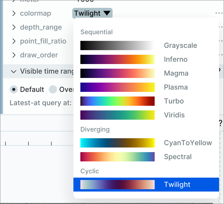
Configurability
In addition to raw performance improvements we’ve added more UI configurability to time series plots, which has been requested by users for a long time. More options, and the ability to set them directly through code are coming in the upcoming Blueprint release.
A caveat on performance for out of order logs
The speedups added in 0.13 slow down ingestion speed for out of order logs. In practice this only matters for scalars logged out of order at high frequency, but it does mean that live time series plots are slow in this case. An update that fixes this is planned for 0.13.1. Follow the progress here.
More great stuff ahead
The 0.13 release was very focused on performance of visualizing time series and other ranges of data. The caching work we did to achieve this massive 20-30x performance jump for time series also paves the way for even more performance improvements in the future.
We'd love to hear how this update impacts your visualization and tooling use in practice as well as the areas where pushing performance further would have the most impact for your use case. Join us on Github or Discord and let us know.
Check out the follow up post if you're interested in learning more about how we made this happen.